
Visual Representations and Perceptions
of Lipoproteins and Atherosclerosis
- Elisa Campos
_______________________________
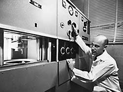
Fig. 1. J. Gofman with the analytical ultracentrifuge, 1957 
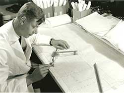
Fig. 2. Frank Lindgren
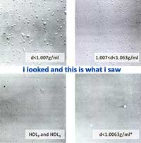
Fig. 3. The Visualization of individual
lipoprotein macromolecules, 1957
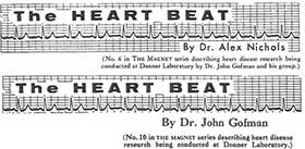
Fig. 5. “The Heart Beat”, 1960
In 1910 cholesterol was declared to be therapeutic; it was a time when clinical concerns were mostly directed towards infectious diseases. Beginning with the observation that infected patients were hypocholesterolemic and that the return of cholesterol to normal levels marked recovery, cholesterol liqueurs were proposed as tonics: cholesterol came to be considered as a sign of health. This is in contrast with the announcement of a wonder drug that zaps cholesterol in an advertisement that followed the commercialization of the first statin, lovastatin, by Merck, in the U.S.A.—the first drug that effectively lowered cholesterol (1987). Thus, cholesterol appears to be a Janus-faced molecule, to which is attributed either a harmful role or a beneficial function. And, to a certain extent, we are seeing the continuation of this duality in the current contrast between good and bad cholesterol.
Following the trajectory of the study of cholesterol across the 20th century in order to interpret the content of scientific images and their informational function, I will use images that describe, explain, classify, analyze or conceptualize, as defined by Harry Robin [1]. As visual representations add an element of persuasion to oral or written communication, they can, therefore, carry representations of distant phenomena to a single site where they can be manipulated, compared and combined in a process of dynamic hybridization and appropriation. This means that the concept of the geography of scientific knowledge put forward by David N. Livingstone [2] also encompasses visual knowledge, thus contributing to the making and reformulating of scientific knowledge, as will be demonstrated using some of the visual representations of lipoproteins. Researchers, besides conveying information through scientific images, are also concerned with them being as clear, unambiguous, simple, graphically elegant and useful as possible, a concern not divorced from aesthetics.
Coronary Heart Disease—A Public Health Problem
By the beginning of the 20th century in the U.S.A., statistics indicated an increase in coronary heart disease (CHD), but at the time the disease was considered a consequence of aging. However, the disease was also common in Russia, and there an investigator found a relationship between cholesterol and death by occlusion of the coronary arteries in rabbits fed on cholesterol.
John Gofman (1918-2007), whose parents had come to the U.S.A. from Russia, became interested in CHD. At Berkeley, using an analytical ultracentrifuge, he elucidated the movement of lipids in circulationlipoproteins reporting, in 1949, that Low Density Lipoproteins (LDL) increase in patients who suffer a myocardial infarction. Figure 1 shows John Gofman next to an iconic apparatus, the analytical ultracentrifuge. The use of the ultracentrifuge required complex calculations, which were carried out by Frank Lindgren (1924-2007), Gofman’s Ph.D. student (fig. 2).
Figure 3 gives us the first direct look at lipoprotein particlesvisual information that adds to the quantitative work. It has a descriptive function in which the image represents the way lipoproteins circulate in the blood. Lipoproteins were in this case turned into a visible image using a specific technique, electron microscopy, in order to enhance our perception abilities. This technique was developed by Thomas Hayes (b.1927), as he explains in his oral history [3]. The next illustration (fig. 4 ) is from a publication from Donner Lab. It portrays the results obtained with the ultracentrifuge. It shows the inverted peaks of the separated lipoproteinsprecisely because these macromolecules float, the protein’s sediment creates a peak above the baseline. We have the relative dimensions of lipoproteins determined using electron microscopy by Thomas Hayes and the concentrations of the different classes of lipoproteins requiring complex calculations, which were carried out by Lindgren. The illustration contributes to the creation of new knowledge, helping the viewer to comprehend complex information, even if its intention and function can only be fully understood by reading the text with which it is associated.
It becomes clear that science is a collaborative effort, unlike art, which tends to be autonomous. By interpreting the picture, the viewer transforms the static image into an active intellectual experience; in this case it may generate an aesthetic response, or at least curiosity. Gofman et al. brought their research to the attention of the public in The Magnet, the Lab’s monthly house organ, 1959/60 (fig. 5). This is an image of a normal electrocardiogram. It is part of the formal mechanisms used to facilitate transfer of meaning among objects, humans and qualities in the image. The transfer is of what is known about heart disease to the surrounding community, in this case people associated with the University of California-Berkeley (UCB).
[1] Harry Robin, The Scientific Image: From Cave to Computer, New York, W. H. Freeman and Company, 1993, p. 9.
[2] Livingstone, D. N., Putting Science in Its Place: Geographies of Scientific Knowledge, Chicago, The University Press of Chicago, 2003, pp. 11-16.
[3] Hayes, T. L, Lipoprotein Research and Electron Microscopy at Donner Laboratory, an oral history conducted by Sally Smith Hughes, Regional Oral History Office / History of Science and Technology program, Bancroft Library, UCB, Berkeley, 2002, p. 10.


