
Beholder of All Ages:
The History
of the World in a French Mappemonde
- Stephen Boyd Davis
_______________________________
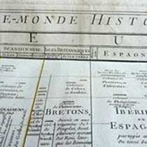
Fig. 7. J. L. Barbeau de la Bruyère,
Mappemonde historique… (detail), 1750 
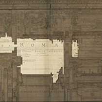
Fig. 8. J. L. Barbeau de la Bruyère,
Mappemonde historique… (detail), 1750
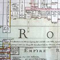
Fig. 9. J. L. Barbeau de la Bruyère,
Mappemonde historique… (detail), 1750
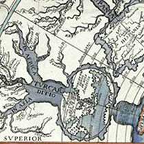
Fig. 10. G. A. Martignoni, Imago Romani
Imperii (detail), 1718
Barbeau confronts the problem that, while on the globe countries may have multiple neighbours, in his chart the two-dimensional disposition has necessarily been compressed into a single dimension: Un Pays dans un Plan Géographique, confine quelquefois avec quatre ou cinq. Dans ce Plan il ne peut avoir que deux Voisins, l’un à droite & l’autre à gauche. Il a donc fallu opter, & mettre aux deux côtés d’une Colomne les Peuples voisins qui ont eu des liaisons fréquentes, ou de plus grands traits historiques communs. (A Country in a Geographical Map shares its borders sometimes with four or five others. In this Chart it can have but two Neighbours, one to its right and one to the left. We have therefore been obliged to place on either side of each Column the neighbouring Peoples with which it has had frequent relations, or the strongest historical connections) [86]. He suggests that the benefits of the chart more than outweigh this inconvénient inevitable (unavoidable deficiency). A partial solution is to use colour to reunite those elements which have become separated: Mais l’objet principal de cette Mappemonde Historique, étant l’Histoire Universelle, on s’arrêtera ici à une autre manière de la considérer, & c’est par rapport à cela que des Couleurs y ont été mises. (But the principal object of this Historical World Map being that of Universal History, we will pause here to consider it in another way; and is in relation to this that the Colours have been applied) [87]. Barbeau explains that Empires have for the most part been coloured solid, so that they can be more easily distinguished at a glance, with only eight colours used [88]. Other Empires less central to Barbeau’s interest, together with the dependencies of the solid-coloured Empires, have coloured inlining in place of block colour [89].
Barbeau tries as far as possible to ensure that countries that in geographic reality adjoin are also adjacent as columns, and uses the width of each column to denote the size of the territory: En rapportant la largeur de ces Empires aux Divisions Géographiques, qui déterminent les Colomnes de la Carte, il est aisé de voir l’étendue de ces Empires & les Pays qu’ils possédoient, sous les noms de la Géographie Moderne (By relating the size of these Empires to the Geographical Divisions which determine the Columns of the Chart, it is easy to see the extent of these Empires and the Lands they possessed, under their modern geographical names) [90]. Leur Durée est aisée à calculer, en faisant attention à l’Année marquée au commencement de ces Empires, & à celle qu’on trouve à la ligne qui les termine (Their Duration is easy to calculate, if one pays attention to the Year marked at the beginning of each Empire, & that which is shown for the line where it ends) [91].
The effectiveness of Barbeau’s design stands out when we consider, for example, the Roman Empire. It proved too difficult to render all the parts of the Empire contiguously in the chart, but a uniform solid tint, reinforced by the prominent lettering ‘Empire des Romains’ extending across all its parts, enables its extent to be identified (fig. 8). Not only does the size and impact of the Roman Empire emerge clearly as a series of graphic blocks, in addition its extent at different periods is easily read-off by tracing a horizontal row across the chart and observing how many blocks and of what size occur in any given time period. Similarly, as Barbeau promises, the fate of individual regions and regimes can be traced vertically — for example, the short-lived Roman rule over the Dacians and longer rule over Illyria (fig. 9).
Martignoni’s design is similarly dominated by Rome — that is the essential point of his Imago — but his is essentially a rhetorical narrative approach. Attempting to investigate any constituent parts of the story, the reader soon becomes lost. Take, for example, the early history of the Eastern Empire (fig. 10). It is near impossible to discover the narrative of sub-regions such as Turcomania and Curdistan (Kurdistan); indeed, the ‘river’ representing this geographic or cultural grouping seems to flow counter to the direction of time, which elsewhere flows from the perimeter of the upper part of the chart down to the perimeter of the lower part that represents the present day. Little can be discerned concerning either the temporal or geographical extent of this or other regimes. How, for instance, are we to read the temporal relationship between the triple tributaries of the Asian, European and African Ottomans? Essentially Martignoni’s diagram comprises a series of vivid graphic gestures that are hard to interrogate and yield little to analysis.
Barbeau used as his engraver Desbruslins, who had engraved the maps for du Fresnoy’s Méthode and the plates for the Tables Chronologiques, and who often worked for Delisle and Buache. Martignoni used as his engraver Tasnière, whose work is dominated by pictorial rather than schematic output. Though Martignoni and Barbeau seem to share objectives O and an idea I, in which cartography is repurposed as chronography, their model M is quite different. The one favours the characteristic figurative images of places and geographic features, the other the mensuration and symbolic codes, the arithmetic-mechanical model, of distances and durations. Each exploits his conceptual and visual borrowings from cartography quite differently, as their views V are finally rendered as pictures P, arriving at very different designs from apparently similar premises.
Triumph of the new visualisation?
The pictorial cartography of Martignoni harks back to a long tradition of figurative metaphorical shapes for history, while Barbeau de la Bruyère introduces the order and precision of the arithmetic-mechanical aspects of cartography. Surprisingly, it is Martignoni who adopts a linear scale for time, with equally spaced concentric lines in the upper part representing each of the centuries from the founding of Rome to the birth of Christ, and again in the lower part from the birth of Christ to the year 1700. Barbeau, for all his focus on mensuration, uses a total of four different scales. In his mappemonde, a given interval of paper represents first 100 years and then, as we recede into the past, 200, 250 and 500 years. This creates a kind of perspective where more distant time occupies less space than recent times. In some respects, this is eminently practical, since there is almost always more data available for recent times than for the distant past, and the nearest time is likely to be of the most detailed interest. But it was a feature strongly disliked, both by Priestley who explicitly picks out the non-linear timescale of the Barbeau/Jeffreys’ chart for criticism, and by Barbeu-Dubourg who does not. The latter’s principal objection to non-uniform scales is the confusion created by the differing scales of geographic maps and the need to work compasses-in-hand in order to be sure of estimating distances or periods correctly [92]. Priestley’s objection is similar, specifically that comparisons of durations in different periods becomes too difficult without a constant scale [93]. There is no doubt that comparison of the temporal extents of empires from different periods of history is significantly undermined by the non-uniform scaling in Barbeau’s mappemonde. United by correspondence and by a mutual friendship with Benjamin Franklin, Barbeu-Dubourg and Priestley speak with one voice on the need for uniform timescales, and put their principles into practice in their 1753 Description des Tems and 1764 Chart of Biography respectively.
One might assume at this point that the triumph of the arithmetic-mechanical approach to mapping time had arrived — originally derived from, but increasingly independent of, cartography. Yet in the mapping of history, the reliance on striking visual images, in the manner of Martignoni and his predecessors, would remain. In fact, neither of the prior traditions was expunged by the arithmetic-mechanical view. Textual lists and tables remained, and still remain, the most common means of representing chronologies, largely because they are economic in invention and use of space. Pictorial elements would also persist, such is in Strass’s Strom der Zeiten (1804), where the figuration of histories as flowing streams is more in evidence than any numeric qualities, and so on via Willard’s Temple of Time (1846) into the multiple metaphorical shapings of time in Adams’ Synchronological Chart (1871) and beyond. Emma Willard (1787-1870), referring to her own Temple of Time, describes such an image as ‘a design whose beauty and grandeur naturally attract attention.’ [94] The arithmetic-mechanical approach never overthrew the desire for such images. However, it did offer a new alternative, one leading into the long tradition not only of chronographics but of data visualisation more broadly down to the present time. In the process, it helped to both disseminate and reinforce a new ontology of historical time as something uniform, mathematical, and susceptible to mapping.
Acknowledgements
The author gratefully acknowledges advice on translation from Florian Kräutli and Marzia Manera. He also appreciates the kind assistance provided by the Bibliothèque Municipale Dijon, Marie-Odile Bernez of Université de Bourgogne, John Rylands Library University of Manchester, Wren Library Trinity College Cambridge, and the David Rumsey Historical Map Collection.
[86] Ibid., p. 19.
[87] Ibid., p. 13.
[88] Ibid., p. 15.
[89] Ibid., p. 19.
[90] Ibid., p. 15.
[91] Ibid., p. 17.
[92] J. Barbeu-Dubourg, Chronographie ou Description des Tems (Chronography or Depiction of Time), Op. cit., p. 7.
[93] J. Priestley, A Description of a Chart of Biography, Op. cit., p. 8.
[94] E. Willard, The Temple of Time, Willard’s Map of time: a companion to the Historic guide, New York, A. S. Barnes & Co, 1846.


